Online casino design can significantly impact the success of a brand and its ability to acquire first-time depositors. Not only does the design attract players, but it also provides the user journey they need to sign up, deposit and play without delay.
To learn more about how casino design impacts customer acquisition, we sat down with Joonas Karhu, CEO of the UK affiliate site Bojoko.com. He will talk us through the impact he sees casino design has on conversions and the ability of UK casinos to attract first-time depositors.
How important would you say it is for a casino to get its website design right?
It is critical. As with any website or app that consumers engage with, the design and layout significantly impact the user experience and whether players continue to engage with the website. Ensuring a smooth and seamless customer onboarding process is particularly important for online casinos. Users need to be able to sign up, make a deposit, find the games they want to play and make a withdrawal in as few steps as possible. Bad design adds friction, and this sees players drop off.
When it comes to customer acquisition, the casino must catch players’ attention and make it easy for them to see what it has to offer. This is certainly true for welcome bonuses, promotions, and even the game library. Given the highly competitive nature of the online casino industry in the UK, a casino’s branding, design, and layout can act as a powerful differentiator in just how successful a casino ends up being.
To what extent can a casino’s design impact conversion?
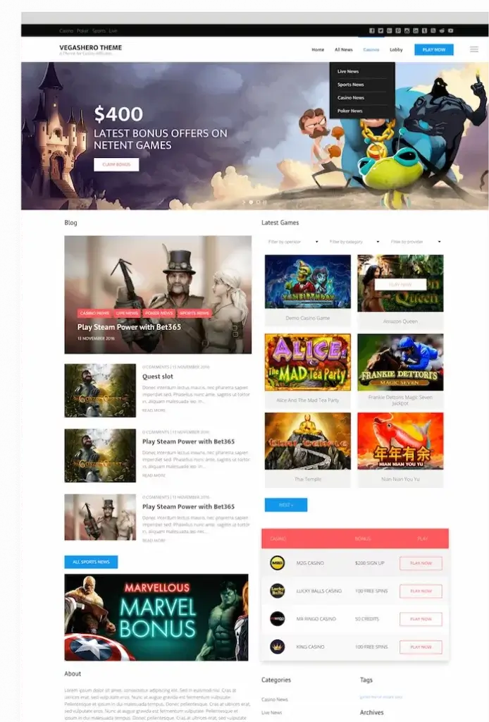
While a casino can coast, at least to a certain extent, on great offers and features, design can be critical for conversion. Not only does the design help the casino brand to stand out, but it’s also what ensures that players know what the casino has to offer before they decide to sign up and play. The clearer the bonuses are presented, the better. The same goes for the game library, as players need to see what games are available.

The design of the casino is also indicative of the experience players will receive once they have signed up. A casino with intuitive and easy to navigate will likely offer a superior experience that players will want to continue to enjoy.
What are the key elements that make a casino visually appealing to new users?
A new user should immediately be able to see the welcome offer, the key terms of said offer, and how to sign up. They should also be able to, more or less at a glance, get an idea of what kind of casino they will be joining in terms of look, feel and game selection. If these elements are set up right, you can immediately speak to the sensibilities of your target audience and draw them in.
Beyond the basics, a casino should have a strong brand identity and theme. A striking colour scheme generally doesn’t hurt either. This helps the casino catch players’ eyes, especially when lined up alongside rival brands on sites such as Bojoko.
Casinos have their own approach to design, with some going for busy layouts packed with graphics and illustrations while others go with a more stripped-back look and feel. Frankly, both can be very successful. Different designs appeal to different players, and that’s why it’s important each casino knows which type of player it is targeting.

In some ways, the design of the casino is the best way for a brand to differentiate itself, as many casinos offer similar bonuses, the same games, etc. This is what makes design and overall brand identity into something that can be used to bring in first-time depositors. It should also go without saying that the design, layout and UX must be fully optimised for mobile, as this is how most players will engage with your product.
Does the design have any effect on customer retention?
Absolutely! What we see is that brands that are well-designed and that offer a seamless player experience are the ones that are better able to retain players. Of course, you will need other attributes, such as recurring bonuses, a strong game selection, and various other features, to maintain an as significant a player base as possible. However, the design is a crucial part of this puzzle.
As I mentioned, the player journey through sign-up, verification, deposit, and withdrawal must be done with as little friction as possible. While a casino may be tempting at first glance, players will only stick around if it is a well-oiled machine. This means that everything must be easily accessible, that crucial information is not hidden, and that players can simply enjoy the games with limited hassle.
Are there any key features many casinos tend to overlook?
There are a couple of design flaws we see more often than we’d like, and both are tied to game libraries. The easiest to address is when you have a jackpot section but do not show the progressive jackpot sizes. Players love to see which slot has the largest jackpot at any given moment, and seeing them grow bigger and bigger creates excitement. There is no real reason to overlook this, as it is simultaneously user-friendly and drives conversion.

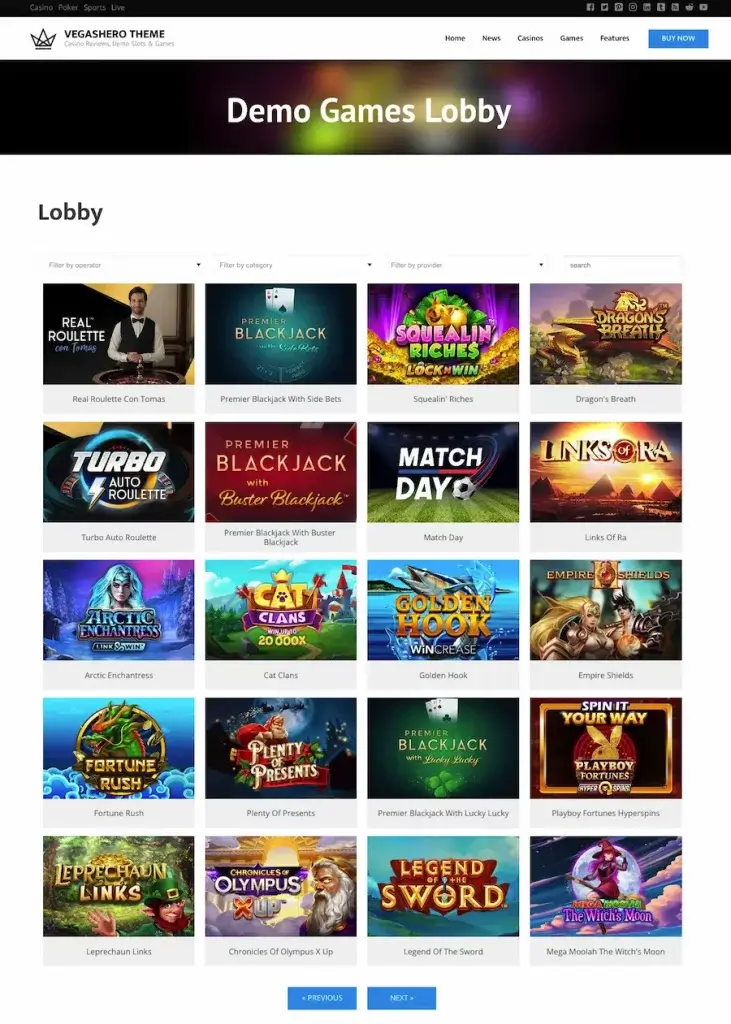
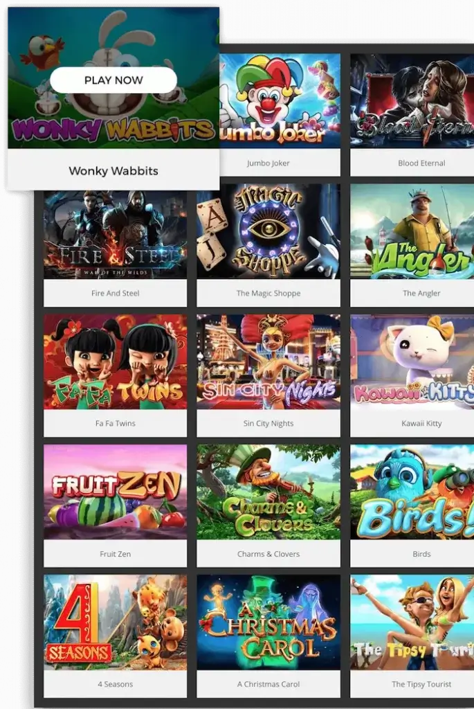
The second issue I would like to highlight is how casinos organise their entire game library. We are now at the point where it is common for casinos to host more than 2,000 titles. This is a lot of content and can be tough to sort through. Game libraries should be designed so that users can not only find the exact game they are looking for through a quick search or get some ideas of where to start from a few standard game categories, they should also provide a varied selection of easy-to-navigate filters. This allows players to find the exact kinds of games they are looking for, especially if they might be blanking on the name of a slot and sitting there in general frustration.
Can the layout of the casino impact how trustworthy they come across?
Unless the casino design comes across as downright amateurish or the UX is glitchy, this will generally not be the case. What makes British players trust a brand is knowing that it holds a licence from and thus is regulated and overseen by the UK Gambling Commission. This is why so many players choose to find online casinos through affiliate sites such as Bojoko because they can be sure that all of the brands listed on our site are trustworthy and reputable.
What design advice would you give to new casinos launching in the UK market?
They should consider finding something that can help them stand out, as most new UK casinos look very similar. However, user experience needs to come first. The similarities we see in the design from one casino to another are not by accident. Over time, a tried and true base format has emerged as the design must make the casino’s offers clear, even at a quick glance.
If you are able to create a bold and memorable brand while maintaining all the essential features necessary for users to have a good experience and know where they can find each feature on your site, you are golden.